To create my title sequence, I used the bath tub, some blue bubble bath and an underwater iPhone case. I placed my iPhone into the case and begun recording, placing it under the water and keeping it steady. With my other hand, I squeezed some of the bubble bath out and as it hit the water, it slowed down and coiled a bit, creating a really interesting pattern. I experimented doing it at different distances from the camera and also squeezing out different amounts at different speeds and varying the force I used to squeezed it, this changed the pattern as well.
After I got the footage, I uploaded it to Final Cut Pro and chose my favourite part of the footage. I then cut it down and put 'fade to colour' on both ends of the footage. Then I had to choose a production company name. Having decided that there weren't really any names which would really apply to the visual, I came up with a more generic name of 'Interpix Productions' as I thought it sounded sophisticated, was related to films ('pix') and there is alliteration of the 'p'. About one second in, the typography of 'INTERPIX PRODUCTIONS' appears and I used a 'Typewriter' effect to bring the text on. It's in the centre of the screen, big enough to be the main focus of the sequence but not so big that it's attracting away from the unusual visual behind it. After having watched it through, I decided that the typewriting effect didn't quite match the colours of the footage. Therefore, I put a filter on the footage which gave it a tea-stained tinge and this successfully aged the whole ident. The footage then fades to black and the writing remains on the screen so that it's the last thing the viewers are shown (I took inspiration from Miramax's ident doing this) and then the whole thing fades to black. However, I then realised that it was 4 seconds too long so had to cut a section out as well as reducing the time that the fades had. Unfortunately this made it seemed more rushed but it had to fit into the 7 seconds maximum time limit. The music I chose to put to it was the beginning few notes of 'Lost Stars' by Kiera Knightley. It's piano which is quite soft and quiet and it again doesn't take the focus off the production companies name.
Lionsgate is a Canadian-American entertainment company founded Vancouver, British Columbia on July 3rd 1997 with their headquarters in Santa Monica, California. They're the seventh most profitable movie studio in the world. Lionsgate Films aren't to be confused with Robert Altman's former company "Lion's Gate Films" although both companies are named after the Lion's Gate bridge in Vancouver. Lionsgate are best known for their films such as the Saw franchise, the Hunger Games films and the famous Texas Chainsaw 3D.
The first shot of the Lionsgate ident is of a large group of clockwork cogs working. This is the companies "cogs whirring". as the camera takes the audience over the top of the cogs and the tracks backwards, we get a view of this vast "room" filled with gears working away.
As the camera tracks backwards even further, the audience travels backwards out of a keyhole. This effectively symbolises the thought that Lionsgate put into their work unlocks a doorway to another place
This "other place" that Lionsgate unlocks the door to is seemingly a heavenly place represented by the bright light that shines through as the grand looking doors gradually swing open.
When the doors are finally open, we see the Lionsgate logo amongst silver-lined clouds suggesting that this other world is a world of dreams which they have created with their well thought and produced films.
Miramax was founded by brothers, Harvey and Bob Weinstein in Buffalo, New York. They named the company by combining their parents' first names- Max and Miriam. The film company was originally set up to distribute independent films which were deemed commercially unfeasible by the major studios. Since starting up in 1979, Miramax has been responsible for some hugely successful films: Pulp Fiction, Mr Holmes, Finding Neverland, Chicago, The Switch, Tom and Jerry the Movie, Gnomeo and Juliette, Boy in the Striped Pyjamas and many more recognisable titles.
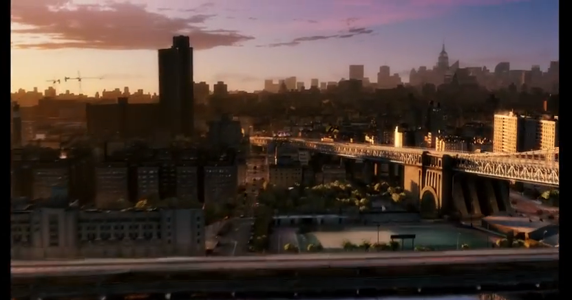
This first shot is of the Brooklyn River and the audience sees the reflection of the tips of a few of the skyscrapers and the shadow which the bridge has casted. This is a high angle shot and it quickly tilts up and is level with Brooklyn bridge (pictured below). The colours are all quite soft which suggests an inviting film company and it also shows that this image is reflecting the morning in New York City.
This next picture shows how the camera is never still. As an audience, we 'fly' over Brooklyn Bridge and over the river (which gives the whole ident a 3D quality) and deeper into the heart of the city. This swooping action, (which is accompanied by a diegetic swooping noise that the audience would supposedly make as they were nearing the city) again invites the audience in and allows them to witness a perspective of New York that they may have never had the chance to experience using an aerial shot. By giving the audience a new sight, this creates the impression that the production company has a new and innovative film that the viewers won't have seen anything like before.
In this part, the audience get to experience some iconic landmarks, noises and features of NYC. For example, throughout, there is a non-diegetic peaceful piano playing which is calm and relaxing, and as the audience enters into the city, we hear the diegetic sound of a train chugging along and public transport is a common representation of a big, developed city. Because an aerial shot is being used to capture as much of the city as possible, we can see the long avenues in NY and in the editing, they've time-lapsed the cars and iconic taxis so it creates the impression of time passing throughout a day. This affect has also resulted in the car lights all merging into one which could resemble the light, happiness and hope that this production company brings with its films to an audience.
The time-lapse is used effectively because it shows the passing of time through the gradual but fast colour change in the sky. New York is referred to as 'the city that never sleeps'; it's constantly awake and always busy. So, when the natural light from the sun fades, the city remains buzzing and this is shown through the lighting up of all the street lights and the lights in the skyscrapers.
(Here, you can see the blurred traffic lighting as well as the city beginning to light up.)
This next bit is where Miramax brings their logo into the ident and they do this through the editing and it's almost like an illusion. Firstly though, the camera is finally still and stops swooping into the city, however it is obvious that this was done deliberately because it has New York's most iconic buildings in the background e.g. The Empire State, The Chrysler building etc. and they have been made even lighter than the rest of the buildings so that they stand out. This shows that Miramax are a very patriotic business and they want their audience to know exactly where the production company originated. As the camera comes to a halt, it's edited so that it appears like all the lights from the city are being used to create the MIRAMAX logo; it has a pixilating affect but it also reveals the unity between New York and Miramax.
The background image of the city is slowly faded out, even though the audience can still see a faint skyline silhouette. Then the city completely disappears and leaves the Miramax logo boldly in the centre of a black screen for a few seconds so that this is the last thing that the audiences' minds are focussed on. The logo is simple and yet very loud due to its boldness and contrast of colours. The non-diegetic piano music also ends with a common crescendo of notes which gives a cinematic ending to the piece.
Picturehouse is an independent production company founded in 2005. It was established in New York. Their most famous release is Pan's Labyrinth, which was released in 2006 and was nominated for six Oscars, winning three. They shut down in May 2008 but was relaunched in 2013. They have also released La Vie En Rose, The Orphanage and Run, Fatboy, Run. The company produces films from a number of genres, including thriller, comedy and fantasy. The establishing shot of is a high angle shot of a lit up town at night. This suggests that one of the company's objectives is to be down to earth. Also, as the camera is angled so that it is looking through the logo at the town, it shows that the company's priority is the audience and they care about the people and their needs.
In this shot, the lights are shown to be gradually growing brighter but at the same time flickering. This suggests that the company worked hard to get to the where they are and they earned their status. The low angle shot suggests that the town looks up to the production company and it highlights their importance. As the name is in lights, their importance is emphasised as it stands out against the pink/blue sky. The colour choice for the sky using a baby blue and baby pink, which are soft and lighthearted colours, suggests that the company is relaxed and comfortable, rather than using harsh colours for the sky. The birds in the ident also suggests that they are environmentally friendly and ensure their work doesn't affect the environment, which gives them a competitive edge and is an attractive asset to have.
In this low angle long shot of the sign portrays it as being old cinema style, with the scaffolding suggesting the 60's. The neon style lights also add evidence for the cinema style. This suggests that the company makes memorable and good old films, which will be remembered for years to come.
The typography at the end of the ident, goes bold and the focus is aimed at the sign. This makes it look more modern and therefore suggests that the company keeps up to date with the latest trends.
The editing is very basic as only cuts are used to show different angles of the logo. This suggests that the company want to take different perspectives and have the ability to see things from a number of different points of view, which may be one of their main objectives.
The sound in the ident is an upbeat and happy tune. It is fast pace and orchestral suggesting tradition. It is also very prestigious which could highlight the journey which Picturehouse made in order to earn the status which they currently have. This is because the production company was expected to fail but instead has increased in popularity and reputation, producing a number of well known award winning films.
There are many things in this film opening which I feel are very effective for the genre, which is a hybrid of psychological and slasher horror. Some of the ideas from this opening can be used to inspire our group coursework practical task. The main areas which I found were most effective were:
Sound
Camera angles
Mise-en-scene
Typography
Editing
In one of the first shots of the opening sequence, there is a large book shown through an extreme close up. The book is dominantly bleak colours, with dark ivory pages and a dark brown cover. This initially gives a hint of the genre of the film to the audience. This is also evident through the use of shadows in the frame, which conforms to the common conventions of psychological horrors. The opening of Se7en is very enigmatic, and this is highlighted in this shot as the extreme close up means that the audience can only see what the antagonist wants them to see, further suggesting the power of the antagonist.
This aerial shot of what seems like a drawing or photograph of hands highlights the disfigurement of the mystery character. The use of black and white, which is a common convention of psychological horrors, increases the eeriness of the shot, as this emphasises the texture of the hands. Artificial lighting is also dominant in this frame putting the focus on the hands, this also creates a shadow effect on a large proportion of the shot. This puts the audience on edge as the visibility is limited to what the antagonist wants them to see.
The extreme close up shot of the antagonist using a razor blade to scrape off his fingerprints. This suggests to the audience that the killer wants to keep his identity hidden. This is then juxtaposed as this is the first time in the opening that the killer is revealed to the audience. By just showing the tips of his fingers, he is represented to be delicate and precise with his kills. Similarly, his personality is slightly uncovered by his fingers being dirty and unkept which also suggests that they are a male antagonist. Also, the precision with the blade highlights that he has done this is before and is used to the pain factor.
There is an extreme close up of the antagonist writing in his book, but the writing is unfocused causing curiosity and confusion as the audience want to know what he is writing. This shot is followed by an upside down close up of the book which highlights that the antagonist is teasing the audience to see what he is doing, without fully revealing it. The fast paced editing causes disorientation and as the shots continuously change quickly, they aren't given enough time to acknowledge and understand what they are being shown, therefore creating an enigmatic effect.
An extreme close up of a different book shows the antagonist highlighting particular words including 'transexual' and 'homosexual' which suggests to the audience the type of people that the killer is targeting. It also allows the audience to develop their knowledge on the character, without revealing too much about him which creates suspense as the audience want to know more about the main character.
In this shot, there is a photograph of a young boy. The antagonist uses a thick black marker to cross through the boy's eyes and then follows it up by drawing horizontal lines across the rest of the boy's face. The fact that the killer crossed the eyes out first suggests that he objectifies his targets and this is highlighted as he crosses out the eyes which portray the most emotion and he has taken away a part of the boy's identity.
The shadow in this shot highlights the killers hidden identity. It also suggests that the killer is teasing the audience, by allowing them to see specific parts of him, like his hands but not the rest of him. The writing on the page is only shown for a small period of time, not giving the audience enough time to read it, apart from the title which has a box around it - 'greed'. This highlights to the audience and gives them an understanding about the film, as from this and the title 'Se7en' they can work out that there is a relation to the seven deadly sins. This therefore allows them to assume that the reason for his murders is related to the seven deadly sins and potentially suggests that he is targeting specific people according to these sins.
Finally, the sound gets louder and more fast paced throughout the film opening to increase tension. This is then abruptly cut off in the last few seconds of the opening so that the audiences attention can be on the non-diegetic recording of the phrase 'you kept me closer to God'. This conforms to the common conventions of psychological horror being related to religion. The non-diegetic music throughout the opening is a disorientating metallic and industrial soundtrack including metal twangs. This highlights the idea that the antagonist has a machine-like killing style which is therefore emotionless. The lack of diegetic sound highlights the idea that the killer is purposely hiding his identity from the audience.
After having watched the opening credits of Se7en, there were many features within it that TDAC can look at and analyse for inspiration for our own film opening. The features also conformed to the genre of Se7en which is psychological/slasher horror. It did this by using all four technical areas: camera angles, sound, mise en scene and editing. Analysing this opening will be really useful and good inspiration for our own.
In the first shot of the opening, the use of this tattered, worn book as mise-en-scene could be showing the old age of the era. It looks like a notebook which again reinforces the depth of the killers mind because he is writing and planning about his murders. This conforms to the psychological/slasher genre because there is a deeper level to the killer's understanding.
The distortion of the typography mirrors the hidden identity of the antagonist killer whom we see shaving his fingerprints off to mask his identity. This action indicates to the audience that he is going to commit a crime at some point. The typography is also sans serif which is quite unusual because films which are based in the past and also films which have religious connotations often have serif lettering.
This is a close up shot of the person shaving their fingerprints off. Just from looking at the fingers, the audience can tell that the villain is probably a male because of the shape of the fingers and the shortly cut fingernails as well as the fact they they are dirty and not well kept. It's also quite grim shaving the skin off of your finger tips and this conforms to the slasher part of the hybrid genre. Even though this camera angle gives clues to the identity of the murderer, it still remains a secret as there are only ever close ups of the hands.
There are quite a few examples throughout this opening of having two translucent shots which are placed on top of each other. In this example of the man writing, not only does it create a ghostly affect but it also creates the illusion of time passing, indicating that he's got a lot to write about.
The translucent shot then changes and the same shot of the close up of the pen writing is then overlaid with a close up of the actual writing. This text is illegible to the audience because it's got a mirror effect i.e. it's been reversed and flipped upside down. This technique creates an enigma because the audience want to know what the man is writing about. It's also written in ink, which again nicely sets the scene for the era of the film.
Another close up of text is shown, but this time it is readable (even though it's been edited to only appear for a few seconds so the audience wouldn't have time to read it) however, you see the antagonist crossing words out in thick black ink. This again leaves the audience wondering firstly what the book or text it is that he is reading, but secondly what the words are that he is crossing out and why he's doing it. It seems as though the guy is plotting and planning or recording what he has done which conforms to the psychological part of the hybrid genre; the focus is mainly on the killer. This is also shown in the image below where a drawing of a man appears in a spotlight. He's had his eyes drawn over in the same black ink which is usually what they do when they either want to disguise their identity or because they have died. For this genre though, we can assume that he was a target of the villain and he has probably now been killed.
The non-diegetic music also fits the genre very well. There are a range of sounds that have been edited together and quite often the sounds are slightly uncomfortable to listen to. For example, there is a piercing squeak that at first seems to be a girl screaming but then just turns into a computer generated screech, which keeps the audience guessing as to what the sounds could be. Not only this, but they overlap each other as well and are cut off quite abruptly, creating a sense of uncertainty and a lack of closure. There's also a constant drumming beat which increases in volume which builds suspense and then drops back down again. This keeps the audience on edge because they don't know when the music will suddenly pick up; it is deliberately inconsistent. Finally, the only verbal lyric in the track is at the very end with one line saying 'You kept me closer to God'. This conforms to the hybrid genre because from this it is confirmed that there is a religious link. It also ends with an echoing boom which is the only definitive part of the track; this signals the end of the opening sequence.
I watched the beginning opening sequence of SE7EN and screenshot every time someones name and job role on the film came up. I recorded the times, job role and their name and put it onto a timeline so I could analyse when the credits came up. The purpose for this task was to gain an understanding as to how and how often the text is situated throughout the opening. From doing this, I've learnt that the text appears every few seconds and is on the screen for a couple of seconds before disappearing. This task will help the group with our own credits; what we need to include (i.e. job roles), how long and often the text comes up and how the writing appears.
When tasked with lighting, I was relatively puzzled as to
what to write about. However, after a few minutes of research I was overwhelmed
with ways in which I could create effective lighting to bring attention to an
object, or to draw attention past the object and towards the foreground or
background. There are, however, two main methods of lighting I’d like to look
at using in our production.
The first method is basically soft/hard lighting. This is a
technique which was initially used in Noir films to add a more ‘cool’ feel to
the film as the films were all about stylish gangster staring at something to
the side for dramatic effect. This can be put into psychological horror films.
For instance, someone is sat down working at a desk which is facing away from
the door. The fore lighting would be as simple as a desk lamp which I've used
for my demonstration, and then have harder lighting such as a hallway light
which is shining into the room. This can be used to draw attention to the
hallway from the audience to notice a person’s shadow darting across the
hallway or to create an outline of a figure standing in the doorway to the
room.
This is the setup I used. It involved a small desk lamp positioned behind/next to the camera and then harder lighting in the back ground to create the effect.
This was the effect created by the soft/hard lighting. The face of the guitar is gently lit up. However, I feel like my attention is being drawn towards the two guitars in the background as they're highlighted by the harder lighting.
The next method I have used for lighting, isn't a technique as such, but more of a way of directing light. I created my own lighting reflector as opposed to buying one and you can still get similar effects with a flat object and some foil.
As you can see, all I had done was wrap some foil around a baking tray and now it's good to go.
All I had done was use a music stand to hold the reflector steady and then angled hard lighting at the reflector.
This is the effect it created. Although the light is more focused at a single point compared to using the hard lighting I had avaliable, this is really good for filming outside at night as you could easily have a light directed at the reflector mounted on a tripod to pan following a character.
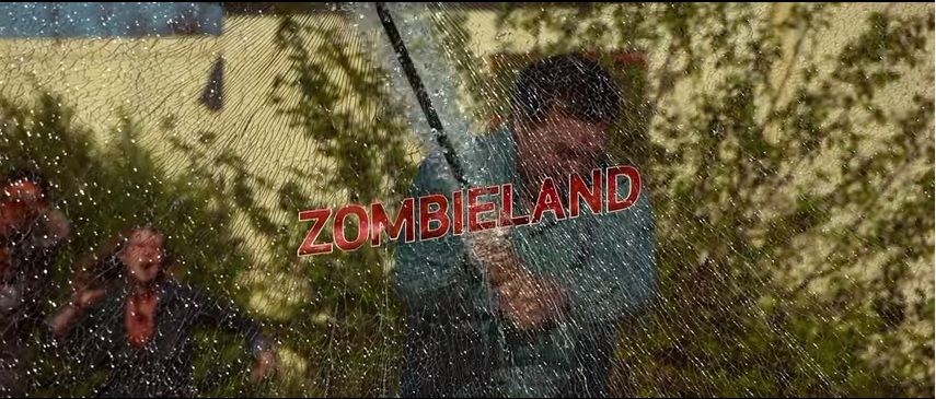
In the opening for Zombieland, the viewer is immediately fully immersed in the story and knows right away they are watching a zombie comedy film. This full immersion is achieved through effects such as using one, continuous shot in the very beginning of the film, which acts as a point of view for the audience.
The narration also contributes to this immersion, as the audience is being directly spoken to, and is being given advice. This causes the viewer to pay attention and immediately focus on the film, absorbing them in the plot before it has truly begun.
The opening credits use clever and interesting graphics, which appeals to the target audience of teens and young adults. The opening credits also include a lot of zombies and gore in comedy situations, which not only entices the viewer but reinforces the zom com genre.
In the opening shot of the American flag on the car, the narration mentions the United States of America in a patriotic tone, however it is pitiful as the USA is no more. Accompanying this is the American national anthem, however it is distorted and slowed down, representing the malformation of the country.
We were set the task of analysing the opening credits in the film Se7en. I looked at the exact second in which each title came up, in order to look at the order that they appeared as well as what each one specifically said, which I discovered was usually the job role and their name. The purpose of this task was to improve my understanding of the opening sequence, as the research can be used to put our credits into our opening sequence, and we will be able to compare the two in order to check it looks professional. Also, it gave me an idea of what the credits actually say, as it is their name and job role so the audience know which part of the film they worked on.
From doing the timeline of credits, I have learnt that there are a vast amount of people mentioned in the opening credits alone. It also clearly shows what each of them do, which is helpful for the audience in identifying the production teams individual job roles. Overall, I have learnt the structure of the opening credits which I can then adapt and use in creating our own opening sequence.
Deconstruction of Insidious - Psychological Horror
I first started by researching into popular psychological horrors and then chose to do Insidious, as it conformed to a number of the conventions of the genre. The conventions of a film in this genre are listed below:
Setting is usually in big houses, woodland, school, warehouse, hospital
Weapons are not usually physical weapons
Use of shadows/ silhouettes
Usually contrapuntal sound
Dark clothing
Use of low key lighting
Usually use flashbacks
Victims are usually a 'Normal Family'
Editing techniques include black and white or sepia effect
Editing usually involves 'flickering' in the opening sequence
The first scene in the opening sequence is of a young boy in his bedroom at night. This conforms to many of the common conventions of a psychological horror, as the setting is in a house, and his room is decorated as you would expect a young boy's room to look. The mise-en-scene all conforms to the child's age and so there is nothing out of place in the room. The use of low key lighting adds to the effect of the genre as there are many sections of the room which are black and so cannot be identified. This causes the audience to become unnerved of the unknown.
This shot of what looks like a hallway also conforms to the conventions. The low key lighting and the use of the one lamp to light up the room suggests to the audience that there are things lurking in the darkness which cannot be seen. The setting of a normal house also adds to the effectiveness and realism as the audience can relate to being situated in these settings. The use of the silhouette adds to the eerie atmosphere of the scene, as the window of the left has shadows of an unidentifiable nature which juxtaposes the shadow on the right which is clear and can instantly be detected.
The typography used for the title of the film, INSIDIOUS, is written in a deep crimson red colour which connotes danger, and specifically blood. The font used also conforms to the idea of danger as the edges are sharp and threatening as serif is used. The title is used to highlight the ideas of the film, so the font and colour portrays jeopardy within the film narrative. The black background connotes death which is also a key theme of horror films. The contrast between the red writing and the black background creates a sinister look and identifies the film as a horror.
The use of a low angle long shot of the house establishes the setting for the audience. This creates realism as the house is an ordinary setting which is the natural environment for the audience. The use of a low angle shot makes the house look much larger than it is which can cause the audience to feel vulnerable and have a sense of being lost. Editing the scene in black and white makes the scene creepier than it would be in colour. Also, the edges of the frame have been faded so they are darker than the rest of the shot. This creates a frightening portrayal of a normal family setting, which conforms to the psychological horror conventions.
In this scene, the black and white effect is used which creates a mysterious shot of what are generally seen as normal items. The mise-en-scene of children's toys conforms to the common conventions of normalcy within the psychological horror genre. Using childhood toys within the opening sequence not only highlights the presence of children within the film, it also represents them as vulnerable and innocent.
One of the conclusive scenes in the opening sequence is a photo frame with a picture of a family in it. This conforms to common conventions of psychological horror where the antagonist victimises an ordinary and 'normal' family. This is done to add to the realism and frighten the audience as it could happen to them too. The close up of the photo frame emphasises the normalcy of the victims and also shows the audience that these are the characters which are going to be targeted.


