Twisted Pictures is an American independent production company, mainly creating films of the horror genre. It was founded in 2004 by Evolution Entertainment's Mark Burg, Oren Koules and Gregg Hoffman. Their most famous films include the Saw series. In June 2007, the company joined with RKO Pictures to remake four films out of the RKO library - including Five Come Back (1939) and Bedlam (1946). The ident begins with the typography of 'Twisted Pictures', all in lower case in the centre of the screen. It is a light grey steel colour with a gradient to black on the lower half of each letter. The steel colour may be in context of the Saw films, which they are most well known for. It is a sans serif font. The pitch black background relates to the darkness of the genre itself.
The animation of the barbed wire suggests the idea of being trapped with no escape, again highlighting the genre of films which the company produces. A large dagger then falls from above and lands between the two words. This suggests violence and pain.
The dagger then turns and wraps the barbed wire around itself, almost suffocating the words, which suggests that the torture it out of its control.
The screen then flashes to a light grey/blue colour, suggesting it to be thunder, and then the title is released from the barbed wire. Throughout the ident, the sounds are very metallic, which match the visuals. The harsh sounds also represent the genre of the production company, with violent scenes and connotations of pain.
This is the full Twisted Pictures production company ident:
In the beginning of the ident, pixels appear in the centre of the shot, turning inwards and dispersing horizontally across the screen. From this, the pixels turn into the name of the production company.
Light disperses out from around the edge of the text as the name appears. This transition is quite modern, and when coupled with the synthesized sound effect it is made clear that the production company produces modern films.
The ident is not restricted to any one particular genre, which further suggests that the production company produces films from a variety of genres, but particularly modern films.
The following video is the entire short film, but the production company ident is at the very beginning.
For my production company ident, I came up with the name "Elementary Productions" and linked the company logo to the typical idea of an Elementary school age child s drawing of a house which in my opinion works well with the ident.
The software I used to create the ident is called Cinema 4D and is a package you can use to create 3D models and either render them as still images, or go as far as to animate them and then render as a moving animation which is what I did.
To create the house which is on a podium, I had to insert cubes into the 3D "world" and then manipulate them to change their shape and size like so.
This is the interface that I had to interact with to reshape the cubes into the company logo I wanted.
After a large amount of changing the shapes
of cubes, I eventually got the logo I was going for
The next thing I had to do was to add in the
company name "Elementary Productions" which was as simple as adding
in word art to a word document and so took next to no time.
Selecting the option to add in 3D text genuinely is easier than choosing word art.
This is my final, rendered company logo.
The Final and hardest stage of the whole
production of the ident, was the actual animation. Because all the objects are
just mesh and splines (shapes), I have to move them around myself which is no
easy task to make it look smooth. Moreover, I had light fades as well as a
moving camera to take into account as opposed to just moving some shapes around
which all had to be done at the same time otherwise the whole thing would've
looked too judder-y to look professional in any way at all.
Setting up the camera so it can film the product in action.
The following is a video of how the "camera" orbits around the logo and then tracks forward along with the light source changing its intensity constantly throughout the piece.
The final thing I added, was the diegetic soundtrack. The sound track is all from a royalty free account on sound cloud and involved the opening and slamming shut of a metal door which is what I used when the word falls down. The use of metal being grated together creates that eerie feel you get as the company ident for a horror film comes up. A fine example would be the twisted pictures ident.
For the first part of their ident, the word BLOOD flashes up onto a black background. This is effective because it immediately highlights the genre. Using the colour white on a black background makes the word stand out and again makes the genre of horror evident by the boldness. There is parallel sound which also adds to the mystery of the ident which therefore highlights the film opening which the ident is linked to.
The next shot in their ident, the word ORANGE flashes up below BLOOD with orange splatters directly behind the words. The link between the name and the visual adds to the tension within the ident, as blood is usually associated with red but by adding the twist of making it orange suggests that the film opening may contain twists and things may not be as they seem. The sound in this shot is the paint being splattered onto the screen, which matches the visual exactly.
For the final part of their production company ident, PRODUCTIONS appears letter by letter, in a different font under BLOOD ORANGE. The diegetic sound is a typewriter typing the letters onto the screen, again the sound is an exact match to the visual. The screen then fades to black to end the ident.
I like this ident because of its simplicity. The production company name is on the centre of the screen and is quite small, meaning the majority of the screen is black. The colour theme of the ident is also attractive, again due to the simplicity. The use of white and orange on the black shows contrast and makes it stand out, but at the same time adds a suspicious tone as there is a lot of the frame hidden by blackness.
The production company ident was made completely on the computer, as none of the elements were filmed. The software used was Final Cut Pro, so the creator added each word of the title separately. They added the fade to black to the end of the ident to complete it as well as adding the sound of the paint splatter and typewriter.
The following video is the full film opening, although the ident is only from 0.07 seconds to 0.14 seconds.
When brainstorming my initial ideas, I wanted to use the element of fire but wasn't sure how I could make an ident that looked effective but was also safe to film. I also felt that fire links into the genre of horror, as it is a destructive element which is associated with dark themes.
From this idea of using fire, i thought of the different ways I could use it. I thought about writing the production company name on a piece of paper and then, whilst holding it, set it alight at the corner so that it would burn across the page. After reevaluating this, I decided that it would be risky, as fire is unpredictable and there were many elements with the potential to go wrong, as well as the struggle of filming it at the same time.
I then decided to film a log fire, which I built and set alight. This was the safer option as the fire place available was contained behind a glass door, which also meant I could get closer to the fire without getting burnt. This then enabled me to experiment with different camera angles, as well as looking at how close I need to be in order for the fire to look effective.
My next task was to decide a name for my production company. This came after I had the footage, as I wanted the two to have a strong link. I liked the idea 'FIREFLIX STUDIOS' as it had the tone of an already established company by sounding professional. I decided to go with this name.
For the editing stage, firstly I added a slow motion effect onto the footage and then trimmed it to be of the correct length. I changed the slow motion multiple times in order for it to be exactly how I wanted it, which wasn't too slow, but slow enough to see the details in the flame.
I then added the fade to black onto the end of the clip which looked effective.
Next, I added the production company name onto the centre of the clip and decided on white in order for it to contrast with the colours in the fire and then made sure the font was in bold.
I then added a transition on the title so that it entered the frame from the front and faded in.
I then evaluated the sound and decided that the diegetic sound I had from the footage wasn't loud enough or of a good enough quality, but I wanted to use the fire crackle, so I used a fire crackle from YouTube and added it to my clip. I faded out the music with the fire so that everything ended together, cleaning up the whole of the ident.
This is the final production company ident, Fireflix Studios:
When looking for inspiration for my production company ident, I looked at other production companies that specialised in horror. A common theme that each company followed was the strong conformation of the common conventions of horror films. Using this, I decided to use blood as a main feature of my ident, as slasher horror films often contain blood and gore.
From this idea, I experimented with different ways I could use the blood to create a ident that would present the common conventions of the horror genre. Originally, I decided on spreading a layer of blood over the surface and writing the name of the production company in it, also leaving a hand print in the blood. However, when I did this, the blood appeared to be more orange than red, so I thought I would have the writing and hand prints in blood and then alter the colouring in the editing process. In the end, this is what I opted for in the final version.
When composing a name for the production company, I wanted a title that would relate to the horror genre. I though of Red Handed, as this incorporates the idea of being caught red handed, as often happens in slasher horror films, where typically the villain is caught and stopped. The imagery of blood stained hands is also created by this title, and so I thought this was the best choice.
In the editing process, I firstly colourised the clip and enhanced the red tones. This gave a red overtone that made the clip darker and conformed more to the horror genre. I then added a distortion effect, blurring the outer oval of the image. This draws focus to the text and distorts the hand prints, making them more subtle.
I then added blur transitions to the beginning and the end of clip, and imported a dramatic, echoing sound that created tension and sounds creepy. I then put the sound of liquid dropping over the top of the music in time with the blood dropping on the text. I then imported a climatic, dramatic sound as the clip blurs out to give the ending of the ident more of a finality.
This is the full ident for my production company, Red Handed:
Deconstruction of another students Production Company
I researched into other students' indents on YouTube and found an AS example of a film opening with a self-created ident. Firstly, it starts as black and it cuts straight into the image of the dreamcatcher which they potentially designed and created themselves. By doing this, it's immediately clear as to what their production company is called because there is a parallel link between the visuals and the name, 'DreamCatcher Studios'.
The font is quite simple and straightforward but is also sans serif which makes it look soft and gentle, almost dreamy. The contrast of the white dreamcatcher and text against the black background makes the image stand out and the black and white could have different connotations associated with it. It puts across the implication of the dreams being at night time as well as good vs bad being represented with the idea of a dreamcatcher catching and keeping the happy dreams.
Then we see some small circles of light which float across the screen. This again is effective because they're small lights in the dark and they also add to the dreamy effect of the whole ident. The lights come in and out of focus and don't distract from the main logo in the centre.
The lights also create a rainbow refraction which creates a mystical and magical effect, still adding to the 'dream-theme' of this production company.
The group may have used final cut pro to edit this because you can add an effect on after which puts these lights in. If I was to improve it, I think it's a bit too stationary and the only movement is from the moving lights. Therefore, I would have something else moving and whether that means not using an image and instead recording some moving footage and then adding on the text, I think this would have made it more professional if done well and more interesting to the viewers, rather than just having a still image.
When creating my ident, I am going to keep it simple to make it really effective but after having looked at this example, I think I will record some footage and then add on other effects post-production.
Founded by Jason Blum in 2000, Blumhouse Productions is an American horror production company that produces low-budget horror films, the more famous of which include Paranormal Activity, Ouija, Insidious and The Purge. Blumhouse has worked with other, bigger production companies such as Universal Studios and Lionsgate to produce films such as The Purge and Jessabelle respectively.
Blumhouse Productions' ident uses typical conventions from horror films and combines them to create an ident appropriate to the genre. The first shot of the ident is of a wooden chair moving in the air in a dark, decrepit room. This is conforms to the genre that the production company specialises in as inanimate objects moving, either on the ground or in the air, can often be found in supernatural horrors.
The camera then quickly pans to a book spinning in the air with an old mirror and a bookshelf in the background. This mise-en-scene continues to conform to the conventions of horror, with the possessed inanimate objects.
More conventions are adhered to when the camera pans to a young girl walking slowly with her head down and then turns towards the camera, whilst blood is spattered against the wall. Possessed children are a common convention of supernatural horror, making it evident that the ident is appropriate to the genre.
The ident uses one continuous shot and pans around the room, but the camera is handheld and shaky. This indicates a sense of urgency, common in the climatic scenes of a horror film where the protagonist is trying to escape the villain. Furthermore, a flickering effect has been used to reflect the damaged and abandoned nature of the setting, whilst supporting a common convention of horror.
To create my title sequence, I used the bath tub, some blue bubble bath and an underwater iPhone case. I placed my iPhone into the case and begun recording, placing it under the water and keeping it steady. With my other hand, I squeezed some of the bubble bath out and as it hit the water, it slowed down and coiled a bit, creating a really interesting pattern. I experimented doing it at different distances from the camera and also squeezing out different amounts at different speeds and varying the force I used to squeezed it, this changed the pattern as well.
After I got the footage, I uploaded it to Final Cut Pro and chose my favourite part of the footage. I then cut it down and put 'fade to colour' on both ends of the footage. Then I had to choose a production company name. Having decided that there weren't really any names which would really apply to the visual, I came up with a more generic name of 'Interpix Productions' as I thought it sounded sophisticated, was related to films ('pix') and there is alliteration of the 'p'. About one second in, the typography of 'INTERPIX PRODUCTIONS' appears and I used a 'Typewriter' effect to bring the text on. It's in the centre of the screen, big enough to be the main focus of the sequence but not so big that it's attracting away from the unusual visual behind it. After having watched it through, I decided that the typewriting effect didn't quite match the colours of the footage. Therefore, I put a filter on the footage which gave it a tea-stained tinge and this successfully aged the whole ident. The footage then fades to black and the writing remains on the screen so that it's the last thing the viewers are shown (I took inspiration from Miramax's ident doing this) and then the whole thing fades to black. However, I then realised that it was 4 seconds too long so had to cut a section out as well as reducing the time that the fades had. Unfortunately this made it seemed more rushed but it had to fit into the 7 seconds maximum time limit. The music I chose to put to it was the beginning few notes of 'Lost Stars' by Kiera Knightley. It's piano which is quite soft and quiet and it again doesn't take the focus off the production companies name.
Lionsgate is a Canadian-American entertainment company founded Vancouver, British Columbia on July 3rd 1997 with their headquarters in Santa Monica, California. They're the seventh most profitable movie studio in the world. Lionsgate Films aren't to be confused with Robert Altman's former company "Lion's Gate Films" although both companies are named after the Lion's Gate bridge in Vancouver. Lionsgate are best known for their films such as the Saw franchise, the Hunger Games films and the famous Texas Chainsaw 3D.
The first shot of the Lionsgate ident is of a large group of clockwork cogs working. This is the companies "cogs whirring". as the camera takes the audience over the top of the cogs and the tracks backwards, we get a view of this vast "room" filled with gears working away.
As the camera tracks backwards even further, the audience travels backwards out of a keyhole. This effectively symbolises the thought that Lionsgate put into their work unlocks a doorway to another place
This "other place" that Lionsgate unlocks the door to is seemingly a heavenly place represented by the bright light that shines through as the grand looking doors gradually swing open.
When the doors are finally open, we see the Lionsgate logo amongst silver-lined clouds suggesting that this other world is a world of dreams which they have created with their well thought and produced films.
Miramax was founded by brothers, Harvey and Bob Weinstein in Buffalo, New York. They named the company by combining their parents' first names- Max and Miriam. The film company was originally set up to distribute independent films which were deemed commercially unfeasible by the major studios. Since starting up in 1979, Miramax has been responsible for some hugely successful films: Pulp Fiction, Mr Holmes, Finding Neverland, Chicago, The Switch, Tom and Jerry the Movie, Gnomeo and Juliette, Boy in the Striped Pyjamas and many more recognisable titles.
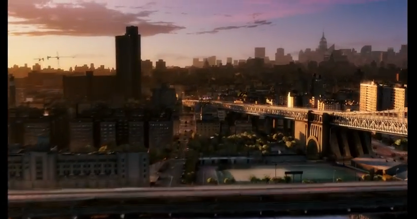
This first shot is of the Brooklyn River and the audience sees the reflection of the tips of a few of the skyscrapers and the shadow which the bridge has casted. This is a high angle shot and it quickly tilts up and is level with Brooklyn bridge (pictured below). The colours are all quite soft which suggests an inviting film company and it also shows that this image is reflecting the morning in New York City.
This next picture shows how the camera is never still. As an audience, we 'fly' over Brooklyn Bridge and over the river (which gives the whole ident a 3D quality) and deeper into the heart of the city. This swooping action, (which is accompanied by a diegetic swooping noise that the audience would supposedly make as they were nearing the city) again invites the audience in and allows them to witness a perspective of New York that they may have never had the chance to experience using an aerial shot. By giving the audience a new sight, this creates the impression that the production company has a new and innovative film that the viewers won't have seen anything like before.
In this part, the audience get to experience some iconic landmarks, noises and features of NYC. For example, throughout, there is a non-diegetic peaceful piano playing which is calm and relaxing, and as the audience enters into the city, we hear the diegetic sound of a train chugging along and public transport is a common representation of a big, developed city. Because an aerial shot is being used to capture as much of the city as possible, we can see the long avenues in NY and in the editing, they've time-lapsed the cars and iconic taxis so it creates the impression of time passing throughout a day. This affect has also resulted in the car lights all merging into one which could resemble the light, happiness and hope that this production company brings with its films to an audience.
The time-lapse is used effectively because it shows the passing of time through the gradual but fast colour change in the sky. New York is referred to as 'the city that never sleeps'; it's constantly awake and always busy. So, when the natural light from the sun fades, the city remains buzzing and this is shown through the lighting up of all the street lights and the lights in the skyscrapers.
(Here, you can see the blurred traffic lighting as well as the city beginning to light up.)
This next bit is where Miramax brings their logo into the ident and they do this through the editing and it's almost like an illusion. Firstly though, the camera is finally still and stops swooping into the city, however it is obvious that this was done deliberately because it has New York's most iconic buildings in the background e.g. The Empire State, The Chrysler building etc. and they have been made even lighter than the rest of the buildings so that they stand out. This shows that Miramax are a very patriotic business and they want their audience to know exactly where the production company originated. As the camera comes to a halt, it's edited so that it appears like all the lights from the city are being used to create the MIRAMAX logo; it has a pixilating affect but it also reveals the unity between New York and Miramax.
The background image of the city is slowly faded out, even though the audience can still see a faint skyline silhouette. Then the city completely disappears and leaves the Miramax logo boldly in the centre of a black screen for a few seconds so that this is the last thing that the audiences' minds are focussed on. The logo is simple and yet very loud due to its boldness and contrast of colours. The non-diegetic piano music also ends with a common crescendo of notes which gives a cinematic ending to the piece.
Picturehouse is an independent production company founded in 2005. It was established in New York. Their most famous release is Pan's Labyrinth, which was released in 2006 and was nominated for six Oscars, winning three. They shut down in May 2008 but was relaunched in 2013. They have also released La Vie En Rose, The Orphanage and Run, Fatboy, Run. The company produces films from a number of genres, including thriller, comedy and fantasy. The establishing shot of is a high angle shot of a lit up town at night. This suggests that one of the company's objectives is to be down to earth. Also, as the camera is angled so that it is looking through the logo at the town, it shows that the company's priority is the audience and they care about the people and their needs.
In this shot, the lights are shown to be gradually growing brighter but at the same time flickering. This suggests that the company worked hard to get to the where they are and they earned their status. The low angle shot suggests that the town looks up to the production company and it highlights their importance. As the name is in lights, their importance is emphasised as it stands out against the pink/blue sky. The colour choice for the sky using a baby blue and baby pink, which are soft and lighthearted colours, suggests that the company is relaxed and comfortable, rather than using harsh colours for the sky. The birds in the ident also suggests that they are environmentally friendly and ensure their work doesn't affect the environment, which gives them a competitive edge and is an attractive asset to have.
In this low angle long shot of the sign portrays it as being old cinema style, with the scaffolding suggesting the 60's. The neon style lights also add evidence for the cinema style. This suggests that the company makes memorable and good old films, which will be remembered for years to come.
The typography at the end of the ident, goes bold and the focus is aimed at the sign. This makes it look more modern and therefore suggests that the company keeps up to date with the latest trends.
The editing is very basic as only cuts are used to show different angles of the logo. This suggests that the company want to take different perspectives and have the ability to see things from a number of different points of view, which may be one of their main objectives.
The sound in the ident is an upbeat and happy tune. It is fast pace and orchestral suggesting tradition. It is also very prestigious which could highlight the journey which Picturehouse made in order to earn the status which they currently have. This is because the production company was expected to fail but instead has increased in popularity and reputation, producing a number of well known award winning films.