Miramax (Films)
Miramax was founded by brothers, Harvey and Bob Weinstein in Buffalo, New York. They named the company by combining their parents' first names- Max and Miriam. The film company was originally set up to distribute independent films which were deemed commercially unfeasible by the major studios. Since starting up in 1979, Miramax has been responsible for some hugely successful films: Pulp Fiction, Mr Holmes, Finding Neverland, Chicago, The Switch, Tom and Jerry the Movie, Gnomeo and Juliette, Boy in the Striped Pyjamas and many more recognisable titles.

This first shot is of the Brooklyn River and the audience sees the reflection of the tips of a few of the skyscrapers and the shadow which the bridge has casted. This is a high angle shot and it quickly tilts up and is level with Brooklyn bridge (pictured below). The colours are all quite soft which suggests an inviting film company and it also shows that this image is reflecting the morning in New York City.

This next picture shows how the camera is never still. As an audience, we 'fly' over Brooklyn Bridge and over the river (which gives the whole ident a 3D quality) and deeper into the heart of the city. This swooping action, (which is accompanied by a diegetic swooping noise that the audience would supposedly make as they were nearing the city) again invites the audience in and allows them to witness a perspective of New York that they may have never had the chance to experience using an aerial shot. By giving the audience a new sight, this creates the impression that the production company has a new and innovative film that the viewers won't have seen anything like before.

In this part, the audience get to experience some iconic landmarks, noises and features of NYC. For example, throughout, there is a non-diegetic peaceful piano playing which is calm and relaxing, and as the audience enters into the city, we hear the diegetic sound of a train chugging along and public transport is a common representation of a big, developed city. Because an aerial shot is being used to capture as much of the city as possible, we can see the long avenues in NY and in the editing, they've time-lapsed the cars and iconic taxis so it creates the impression of time passing throughout a day. This affect has also resulted in the car lights all merging into one which could resemble the light, happiness and hope that this production company brings with its films to an audience.
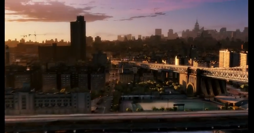
The time-lapse is used effectively because it shows the passing of time through the gradual but fast colour change in the sky. New York is referred to as 'the city that never sleeps'; it's constantly awake and always busy. So, when the natural light from the sun fades, the city remains buzzing and this is shown through the lighting up of all the street lights and the lights in the skyscrapers.

(Here, you can see the blurred traffic lighting as well as the city beginning to light up.)

This next bit is where Miramax brings their logo into the ident and they do this through the editing and it's almost like an illusion. Firstly though, the camera is finally still and stops swooping into the city, however it is obvious that this was done deliberately because it has New York's most iconic buildings in the background e.g. The Empire State, The Chrysler building etc. and they have been made even lighter than the rest of the buildings so that they stand out. This shows that Miramax are a very patriotic business and they want their audience to know exactly where the production company originated. As the camera comes to a halt, it's edited so that it appears like all the lights from the city are being used to create the MIRAMAX logo; it has a pixilating affect but it also reveals the unity between New York and Miramax.

The background image of the city is slowly faded out, even though the audience can still see a faint skyline silhouette. Then the city completely disappears and leaves the Miramax logo boldly in the centre of a black screen for a few seconds so that this is the last thing that the audiences' minds are focussed on. The logo is simple and yet very loud due to its boldness and contrast of colours. The non-diegetic piano music also ends with a common crescendo of notes which gives a cinematic ending to the piece.

Here is the full ident for Miramax
No comments:
Post a Comment