
The next font I looked at was called 'Depressionist 3 Revisited'. I liked this font as the slightly faded lettering is similar to that of a burned out film, which is an effect commonly used within the horror genre. I also like the blockiness of the font, which created a harsh and dramatic typography.

 The third font I looked at was called 'Ringbearer'. I liked the serif style of this font that made it look authentic and archaic. The slightly faded edges were of a similar style to 'Depressionist 3 Revisited', which again reflected the burnt film that can be found within horror.


The font that I decided to use to create the typography was 'Ringbearer'. I decided that this font would look best out of all the fonts I found.

To begin editing, I opened the image of the font in Photoshop as an additional layer to the background.

I then rasterised the image so that it could be manipulated and edited in Photoshop.
Firstly, I used the Paint Bucket Tool to fill the background in black.


I removed the white background from the font, leaving it transparent. I did this by using the Magic Wand Tool and holding shift to select each of the letters and move them so I could delete the background. I then used the Paint Bucket Tool to fill in the text of the title, with 'sense' in white and 'less' in a deep red.

I then added in an image of Tia's face on another layer, placed below the layer with the text.


I then used the Polygonal Lasso Tool to cut the edges of the environment around Tia's head out and delete them, so only Tia's head remained.

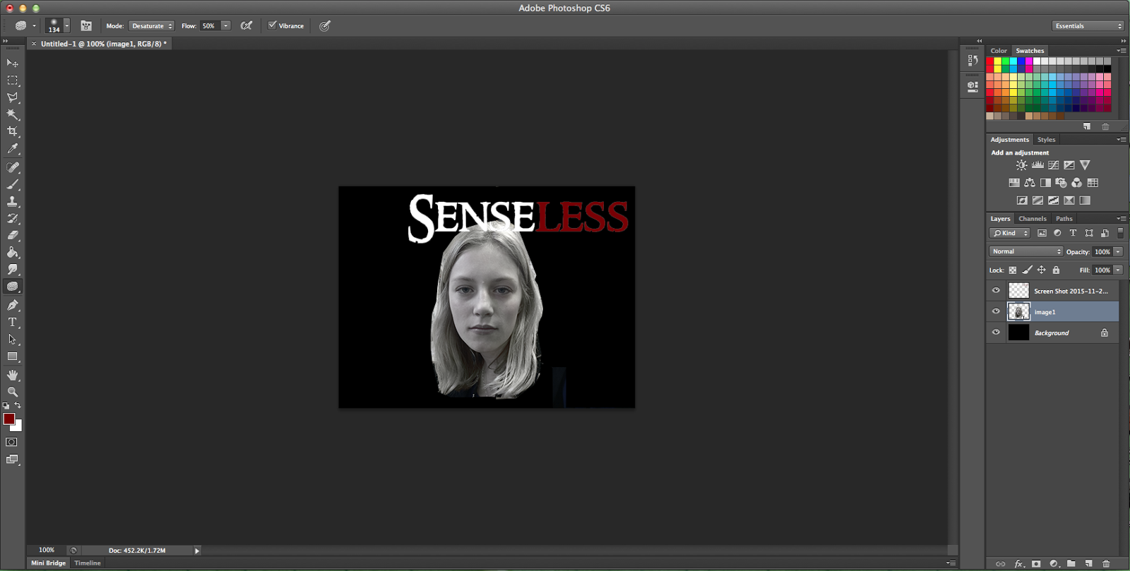
I then used the Sponge Tool to reduce the saturation of Tia's head until the image was entirely in black and white.

I then used the Eraser Tool, on a setting with hardness zero, to fade the edges of Tia's face and smooth them in with the background.

I then used the Blur Tool to defocus the image of Tia's head.


I inserted the image of David in another layer, beneath both Tia's head and the text, and repeated the steps used to create the effects on Tia's head.


I then altered the brightness and contrast of the image, increasing both factors.

I then used the saturation filter and lowered the lightness of the image.

I then decided to create a reflection in the text, so I inserted the image of the text again in a new layer, above all the other layers. I rasterised the image and coloured it in the same way as the original font, using the Paint Bucket Tool.


I then flipped the image horizontally and rotated it by 180 degrees to create the reflected image. I then lined it up perfectly with the original text.


I then used the Eraser Tool with a hardness of zero to fade the edges of the reflection.

Then I used the Blur Tool again to blur the reflected text.


Finally, I used the Smudge Tool to create a distorted effect within the reflection.

I like the style of the typography I created, however I feel it doesn't fit with the plot of the film to reveal who the killer is straight away within the typography, and so would use the face of another victim instead of the killer in order to retain the suspense of not knowing the face of the killer.
No comments:
Post a Comment