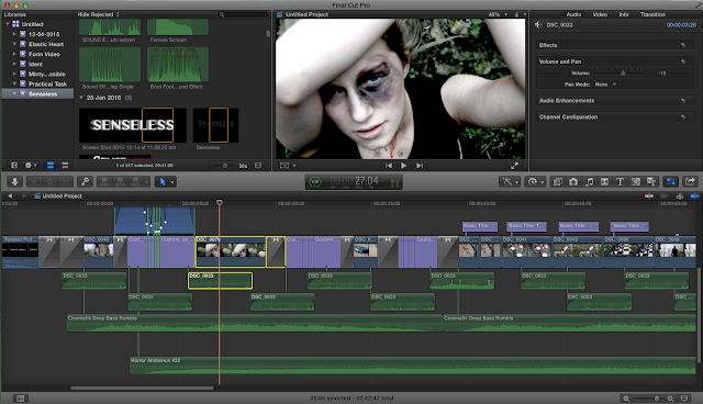
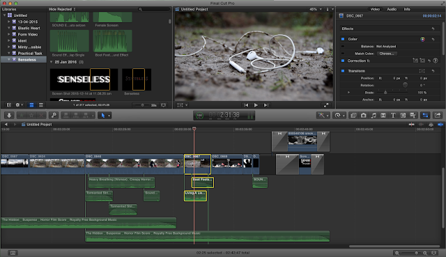
Thursday 25 February 2016

Deconstruction of Sound within Horror

What creates most of the tension and fear in horror films is a suspenseful sound track to accompany the horrific visuals. 
One such example of a soundtrack that adds fear and suspense in a horror film is the main title soundtrack of Halloween. 


Halloween has arguably one of the most iconic soundtracks in horror, with the melody instantly recognisable. The soundtrack builds tension by beginning with the rapid sound of chimes in a melody that creates a sense of suspense. Alongside this is a constant drumming noise, creating a rhythm that entices fear within the audience. This continues until eventually the intense sound of strings and piano builds to create a crescendo which builds tension. The intensity dies down slightly as the piano and strings ease off, but the chime melody continues throughout. More intensity is created as an organ is introduced which creates an authentically eerie sound.  

Deconstruction of Props within Horror

Possibly the most common prop used within horror films, especially of the slasher sub genre, is the weapon of the killer. 

In slashers, the weapon is usually a hand held melee weapon that the killer uses throughout and becomes associated with. This can be seen in Scream, where the killer uses a knife to kill his victims.


The weapons used to kill the victims in slasher horrors can also become the main focus of the plot, such as in the Saw series. The killer uses various methods of killing the victims, such as being cut repeatedly by a razor wire, throat slit with hacksaw and dismembered by chains. Possibly the most obvious weapon used in the series was a giant saw.

Deconstruction of Camera Angles within Horror

Within the horror genre, there are a range of commonly used camera angles to create tension and fear within the film. 
One common camera angle used within the horror genre is extreme close up reaction shots of the protagonists in a time of peril or at a time when the killer is close by and they are hiding. This can be seen in many horror films, such as The Purge. 


Another commonly used shot within horror an establishing shot of the setting, which is commonly the protagonist's home. This can be seen in the slasher horror film, Carrie. 


This can commonly be seen in films where the protagonist wants to be seen as a character that the audience can relate to, and this shot establishes a setting the viewers can relate to, such as a home. 


Deconstruction of Costume within Horror

Within the horror genre, there are common conventions in regard to costume. The three sub-genres of horror each have shared conventions of costume, but there are some variations. 

One common theme throughout the genres is the want to portray the characters as being normal. This is so as the audience can relate to the characters and imagine themselves in the horrific scenarios they are suffering through. As a result, most costumes in all horror that are worn by the protagonists are relatively normal and generally neutral in colour and style. For example, in Insidious, a supernatural horror, the main characters all wear normal clothes.


This can also be seen in Scream, a slasher horror. 


Another aspect of costume within horror is that the antagonist often dresses differently so as to distinguish them as different and abnormal in comparison to the normal protagonists. The way antagonists are identified in the sub-genres does, however vary. 
In slasher horror, the killer will often where a mask. This mask is specific to them and they wear it every time they kill. Not only does this create a specific association with the mask and that franchise, but it adds an enigma to the plot to create a sense of intrigue and mystery as to who the killer is. 
This can be seen in the slasher horror, The Purge.

Editing Deconstruction - Insidious

I decided to look at Insidious and deconstruct it with regards to editing. After watching the opening scene, the techniques which are used throughout are very similar. The main trends I noticed were:

  • steadicam
  • track
  • zoom

One of the first shots in the opening is of a lampshade in a dark room. The camera rotates 180 degrees, so that the lampshade is the correct way up, suspended from the ceiling. During the rotation, the lampshade stays in a central position of the frame. The title also fades down into the shot saying 'A JAMES WAN FILM', where the 'A' and 'FILM' are in white against the black background and the name is on the lampshade and stays there during the rotation. It then fades out from the centre of the word.

When the lampshade is the right way up, the protagonists room is lit up enough for the audience to see. Immediately the camera tracks down, in a south westerly direction, revealing the young boy asleep in his bed, until the point where the camera is in line with the child.

The camera then tracks to the right, focusing on no object in particular, establishing the scene of the bedroom. Although it is a steadicam, there is still a sense of handheld camera within the opening, as the shots are smooth but travel between rooms in a way that looks like human exploration.

After the camera leaves the child's bedroom, it zooms and focuses on a headstone like figure in another dark room. It then immediately tracks left, highlighting more of the house. Then it zooms and tracks at the same time, drawing the focus to different objects and areas in the room, usually the most shadowed area, increasing the focus which the audience are needing to give and therefore adding a sense of tension and suspense. The fast tracking gives an uneasy feel to the opening, giving the audience an idea of what the genre of the film is and what kind of themes are going to be present within the film. 

There is a slight flicker over the title, so that the red changes shade slightly but constantly, adding depth and a more 3D effect to the title. The lack of colour in the opening is juxtaposed by the bright red of the title, although at the same time, the colour has connotations of blood and death.
Overall, the editing in this opening is very smooth but at the same time quite fast paced. This makes the audience have a sense of unease as the camera is moving too fast in a low lit house to focus on specific objects, suggesting there are a lot of secrets hidden in the unknown. This editing is very effective for this film and the genre because before the film has even began the audience are feel tense about what is to come.

Below is the opening scene from Insidious:

Editing Evaluation- Sound- The Scream

Editing Evaluation- Sound- The Scream
TDAC have had much discussion about a certain part of our opening scene and the sound that goes with it. In our film there is a kidnap when the killer emerges from off screen and grabs the unsuspecting victim by covering her mouth. When editing this the footage didn't look quite right so we put the run up to the camera in normal time but then put the kidnap into slow-motion to make it more dramatic which it did, however it still didn't look quite right.
We then decided to play with the sound and put some music in the background. I firstly turned down the contrapuntal music track and then decided to slow it and put a 'large room' effect on which made the music sound eerie and distorted. I put a heavy breathing effect on and also some music which slowly gets louder but there was still something missing because the whole running scene had been building up to this pivotal moment and it didn't really amount to anything.
We tried finding some screams on Youtube that might work but the problem was that in filming, Dave grabbed Tia's mouth first so she wouldn't really have had time to gasp loudly and if she were to scream it would have to sound muffled. With no results in finding a muffled scream on the internet, the group decided to try and record our own using voice recorders on our phones. We tried many different methods to recreate the scream; I tried grabbing Tia's face so it sounded more realistic but it sounded unnatural. She tried screaming into a jumper to make the sound sound like she had a hand over her face but again it wasn't sounding how we wanted. Myself, Charley and Dave all had a go as well but recreating a scream which we weren't quite sure how it would have sounded like if Tia had actually been grabbed.
We decided to submit it as a first draft but the feedback that we got reflected our thoughts exactly. We further discussed sound effects for the kidnap scene but with the footage that we had and without refilming, it wouldn't have looked and sounded realistic and seamless so we opted to leave it as it was. If we were to improve though, we would have rerecorded the scene to make it look as if Tia was struggling a bit more and also would have got her to scream and then we could have used the actual diegetic scream.  


These were some of the videos that we found on YT but didn't think quite worked for our opening:

Prop Creation- Practical task

Prop Creation- Practical Task
For our castle scene, we needed to make it look like it was the killer's lair as well as his home. We had big things to put in the castle like a work table and a mattress which indeed would imply that he was sleeping there but we wanted props that would really make the castle feel realistic and so the group decided that the best way to do this was attention to detail; having smaller props that aren't necessarily essential to the scene but just are an extra touch that the killer may actually have in his living area. The space was fairly big so filling it up was always going to be a challenge but we all were able to bring items from our own homes to the castle.
 This is my mini chessboard and I thought that it might look quite mysterious and give another side to the killers personality. It makes him look lonely because he hasn't got anyone to play with but it also adds to the plot behind a lot of his schemes; it implies that he's a good game-player, he's manipulative and is always one step ahead- like you have to be in chess to win. Having a set up chess board in his castle makes him look like he practises when he has spare time so he's prepared for any move the other player makes.

I then also decided that the killer would need food in his lair to survive. I questioned what sort of food a killer who was crashing in an abandoned castle would eat; he wouldn't have very much money and also the castle is slightly medieval themed so normal packets of food would have looked out of place. Also using shop-bought food would have been product placement so I found a tin at home and peeled off the paper label. I then decided to make a sort of 'gruel' from oats and water to show how poor he is and is just living from basic rations. I then found an old teaspoon and figured that they could just be placed somewhere in the castle. 


I also thought that just scattering some dried pasta on the table would add to the simplicity of his basic rations. The audience wouldn't necessarily notice it but it is just another prop that makes the castle look more lived in.

This lamp I had looks old fashioned and because he doesn't have electricity he would need a source of light.
We also decided to make him have a more 'normal' side as well, almost like the part of him that he was  before he turned into a psychotic killer is still in him. Next to the mattress, we thought to put in a pile of classic old books as well as some newspapers which we thought made his character more interesting and gave him in another persona.
I also decided to buy some tea lights to create a more medieval feeling and again let the audience know that he's living on the bare minimum. Because of the wind, we had to put the candles into jars that Tia brought but this actually worked in our favour as the jars made the area look more rustic and because the flames didn't blow out they flickered and we got a really good shot of them clustered on a rock surface.


Overall we managed to gather together some good, realistic looking props which helped create a good atmosphere in the castle.


Audience Feedback Evaluation

After receiving all of our audience feedback, as a group we went through it to look at what points we could consider when making changes to our opening sequence. We took into account both the positive points made as well as the improvements which were suggested.

The first piece of feedback was very positive, praising the smoky effect paired with the typography at the end of our opening. This is something that my group and I completely agree with, as we were very pleased with how our ending turned out, and thought it was very conventional for our genre. This piece of feedback also said that they liked the 'puddle shot', which I am especially proud of as I helped my mum set up the camera and then film that shot, and I think it adds a creative element regarding camera work to our opening.

For this piece of feedback, we focused more on the improvement, that the title should appear with a more dramatic sound effect. We looked into this and experimented with adding a sound that gave the scene more depth, but it took away from the visual effect of the title, so we decided to stick with what we originally had with the car revving and the smoky exhaust. Also, on this piece of feedback, we were praised for our fake wounds, which were realistic thanks to Charley, who managed to teach herself how to create wounds which didn't look fake, and we decided to use the right amount of wounds so that they were prominent but not overpowering in the opening.

For this piece of feedback, we focused mainly on improvement again, of the pan being too fast. We looked into this, but decided that actually it was a creative shot, and changing the speed to slow it down made it look unrealistic and lost the overall effect of the running scene. Although we took the feedback into consideration and attempted to edit it, for our opening it didn't work slower and so we decided to leave it how it is.

For this piece of feedback, some of the improvements weren't clear enough, as they said that we had used too many titles and they were too fast. This couldn't really be changed, as the placement of our titles and the timings were done due to research and deconstructions of already existing films. It also said to 'record own scene' although all of our shots and scenes had been recorded by our group, and therefore they must've thought that we had found the shot - suggesting that it was of a high enough quality and standard to be professional.
This piece of feedback praised our editing, which as a group we were very proud of as this is something that took a lot of time, effort and teamwork to perfect. After reviewing this piece of feedback, we have added our own production company, which was being changed to add the finishing touches at the time and also looked at changing the scream to make it sound realistic. We looked at many different screams and also tried to create our own scream, but none of which worked as well in the scene and the current scream, so we decided to keep it.

This piece of feedback was vital to our opening scene, and was changed straight away. None of us had realised that the countdown between the castle scene and the running scene was counting the wrong way. This was a very large improvement, but was quick and easy to change - although slightly embarrassing that none of us had realised that it was counting in the wrong direction! After this was changed, we felt much happier with our final product and checked over it again to ensure that we hadn't missed any other vital parts.

Overall, the feedback that we received was very helpful for our group and improved our final product. We are very pleased with our final piece and hope that the audience enjoy our film opening as much as we enjoyed creating it.

Editing Evaluation

As one of our opening shots of the victim in the flashback, we wanted it to be very bold and stand out. So, after I imported the clip, I used the blade tool to shorted it to the best bit. 
Then, I used the fade to black transition, so that the clip is very short and effective, and fades out, so that the victim isn't shown for too long, but at the same time the wounds are exaggerated.
I experimented with the different filters, as I wanted to find one that made the victim look in pain and defenceless, but at the same time add depth to her wounds and the scene. The filter that we finally went with is called burnt sunrise. Then, I detached the sound from another clip, as it was a strong wind sound, which would fit perfectly in setting the scene for the castle lair where the victim is tortured. Again, this added depth to the scene and exaggerated the true conditions of the environment which the victim had been tied up in. 

For one of our final shots, we wanted to play on the idea of losing a sense, as initially our killer was deaf. This idea was that when the victim had been captured, it foreshadowed her ear being cut off, as the music was abruptly stopped and her earphones fell out during her capture. 
During the filming of the shot, it took many attempts to get it right, as we needed the earphones to be in the centre of the shot, and the foot to crush them in the centre. Also, the focus needed to be on the earphones and as they were on the ground, I couldn't use a tripod, so had to manually set the focus and hold a steady shot close to the ground.
To edit this shot, first I imported the clip and use the blade tool to make it the right length. Then, I worked out which bit of the song would be playing at this moment in the narrative and bladed it so that it was the right length, matching the clip of the earphones. Rather than fading out the end of the music, I bladed it to make the cut off very abrupt, making it effective.
 After reviewing this, I decided that actually it needed a stomp sound of the foot making contact with the headphones, again to add depth to the scene and make the shot more realistic. I found one on YouTube and imported it, using the blade tool again to ensure that it was the right clip. I then focused on placing it in the most accurate place, so that the visual matched the sound. 
After this, I faded out the sound of the boot, so that it worked with the transition between the scenes and wasn't cut off as abruptly as the song. As one of the other members in my group had already worked on the main soundtrack, I had to ensure that the added bit for this scene worked well with what we already had, and this meant making a few adjustments regarding the volume the added sound clips. Once this had been changed, the clip was completed and worked very well with our narrative.o

Editing Evaluation

As our opening sequence needed titles and we had already researched into what the titles should say and where they should be placed. For our titles, I wanted to try and incorporate them into the scene. I had seen this be done before but couldn't find a tutorial to teach myself how to do it. I decided to experiment with the editing software, Final Cut Pro.

Firstly, I created a title, simply saying Amy's name. I chose the font 'Engravers Gothic' and then selected the size 120.00, as I experimented and this size fit best with the current shot of the chess board. I then found the transform tool (slightly left of the rewind, play and fast forward button). This selects the text as an object and then gives you a text box like tool to drag around the shot and place it where you want it. I changed the angle of the wording so that it was just sitting on the edge of the chess board. 

I also evaluated the use of colour for the titles, experimenting with black, white and red, to see which colour worked well with both the genre as well as fitting in with the shot. Red stood out too much, and didn't work well with the colours already present, whereas black was too dark and didn't stand out in the scene. At first, we weren't sure about using white, as it is quite bold, but then we decided that it worked best with the scene and added a dramatic effect to the shot.

When watching it back, I noticed that there is a slight tilt from the bottom of the chess board to the shot which is seen below, so I again readjusted the placement of the title in the shot, so although it doesn't begin on the edge of the chess board, it doesn't look out of place when the camera tilts to a different angle of the board.

This shot works really well with the titles, partly because of the extreme close up of the chess board highlighting the vast details and a dramatic contrast between the black and white, as well as the grass. I am glad we used this technique rather than just inserting a normal title as it adds depth to the scene and incorporates the names into the narrative.


I also edited the final title which is seen at the end of the opening scene. Although Charley made the typography, a few changes needed to be made to ensure it was perfect for our genre. This included removing some of the images of the victim and the killer, and focusing more on the detail of the reflection. I worked to incorporate it into our project, and ensure that it fit with not only the narrative, but also the genre. Charley had already used the colours that were conventional for our genre and it was already on a black background. 

First of all, I imported the title and added the transition to both ends of the title. I experimented with the length of the title, in order to get it the right length, but not too long that it got boring. After watching it a few times over, it looked a bit bare. In context, there was no clear link between the title and the final shot of the car boot being slammed. One of the girls added a royalty free car boot slam with the footage, and then added a engine being revved over the title. I really liked this idea, but wanted to incorporate an element of the car within the title, without over powering it and taking the focus away from the main title. On YouTube, I began searching for different smoke effects which could potentially look like a car exhaust. This was a difficult task as I didn't have a clear vision of the type of smoky effect that I was picturing.

Finally, I found a royalty free smoke effect from YouTube that would work perfectly with our title. I imported it over the title and then reduced the opacity, so that it would be seen but still not take the focus from the main title. I then added the same transition as I did for the title, but lengthened the clip so that it lasted longer than the title. Paired with the sound, it sounded like a car pulling away and leaving a trail of smoke, and as a group we decided that it was just what we needed for a dramatic ending to our opening scene.

Wednesday 24 February 2016

Audience Feedback Evaluation

Audience Feedback

When everyone had finished their first drafts of their film openings, they were uploaded to Youtube and we all watched each others. In our groups, after each showing, we had a few minutes to record some feedback to give to each other for what we liked and also any improvements that needed to be made. The openings were also shown to the A2 class to get some fresh, new and non-bias feedback. 

Getting this feedback allows us to get new ideas on how to change our opening as well as allowing us to consider other elements that the group may like but other people, including our target audience, weren't so keen on; having said this, there were also some comments that we disagreed with. 
This group understood the genre which was a good sign because it meant that we were able to get enough conventions into two minutes to make it clear. They liked the muffled earphone music as well as the ending of the scene but they didn't think the scream was realistic. As a group we discussed this and decided to keep the scream because it portrayed the amount of pain that we wanted and we couldn't record a better one which sounded half as good. They also picked up on the fact that we hadn't yet put in our production company; we had taken Dave's production company out so that we could remind Dave that he still has to fix it by correcting the lower case 'p'. (We are still waiting on this...)


In this groups review, they noted that they liked seeing the previous victims in the flashback scene. They also liked the sound throughout however they said that the struggle scene needed sound to it. The group already thought this and we are still trying to find an appropriate sound to go over the top. 

This group said that they really liked the credits at the beginning but with the names within the scenes, there were too many and too fast. To improve on this, we could extend the timing of each of the mise-en-scene prop parts with our names on. This could be a problem though because we are only just within the time limit.


This group liked the contrapuntal sound track that we had written and recorded. They said it was effective and they also liked the fast-past flashback shots. However this group also noted that they didn't understand the need for smoke at the end titles. TDAC were quite surprised by this comment because the smoke at the end is one of our favourite parts; it also looks like it's the exhaust coming out of the car. We have decided to keep the smoke in this because otherwise the typography would be simple and slightly too 'flat' and still as nothing else is moving or happening. 


This group made a very valid point of a mistake that we had made in the editing that no one else had picked up on. The '14 hours, 57 minutes, 32...33...34...etc minutes earlier' was actually counting up when it should have been counting down i.e. getting nearer to the castle scene, not further away. We were very grateful that they picked up on this mistake as we hadn't spotted it. It can be easily changed, we'll just need to count down instead. 


This group liked the fake wounds and the severed ear, they also liked the smokey effect and the muffled earphone music.


This group liked the puddle shot that Tia took and they also liked the typography that Charley created with the two separate colours (white and red) on the word 'senseless'. They did seem to be unsure about the genre though but they put 'gore' down but also psychological so we will need to evaluate our opening to ensure that we include more conventions of a slasher genre.


This group also made an interesting point regarding the countdown. If it had been 14 hours earlier then it would have been dark so to correct this we changed it to 23 hours earlier so it was roughly the same time just in the space of two days instead. They also said that they didn't think the title was conventional, but again after discussing and with all the research we did, we decided to stick with it because it was a one word title like a lot of them are and it is also to do with having one less sense. 


This group also made a comment that we agreed with; the panning shot is too fast and the reason why it's in there is to separate two shots of Tia so the continuity is smoother, however we can probably find another bit of footage to go in instead.


And finally again, this group made a valid point about the titles being 'better integrated with the background' and so we are going to try stabilising the shots so they are more still and then making the text fit better on the edge of the prop that we have chosen to put it on. They said they liked the smoke, the editing with names was amazing and they liked the headphone music as well. 


All in all we are quite pleased with our feedback and we will be making adjustments accordingly. As mentioned there are a few changes that we will be needing to make such as the clock countdown but there are also some comments which we have taken into consideration but won't be acting upon, like the smoke at the end title. 

Tuesday 23 February 2016

Sound Deconstruction

Sound Deconstruction
Within the film industry, sound is vital for creating the theme or atmosphere that the film is trying to create. A soundtrack can make or break a film, so it is imperative that the right sound is created and put with the matching visuals so that the audience gain a greater insight into the genre of the film.
There are two types of sound: parallel and contrapuntal. Parallel sound is when the sound matches what's going on in the scene and contrapuntal is when the music juxtaposes the visuals, creating a contrast- this is commonly done with classical music.
For our film opening, the group discussed and then then decided that we were really going to focus on our sound because we believed that it was potentially the most important part to creating a horror opening. To get inspiration, I listened to some music from youtube.

This soundtrack by Charlie Clouser is from the film 'Dead Silence'. The beginning of the song starts with a lullaby-like tune being played; it's slow but the piano notes are also slightly off key, giving the music a chilling feel. Additionally, acciaccatura notes, or grace notes, are added which are very short notes played before a longer note- acciaccatura literally means crushed. This adds an echoey effect, implying that this melody is being played in a large, empty, isolated room. There is then a chorus of groaning, dead-sounding voices which get louder and smoothly leads into a much faster version of the lullaby music at the beginning.

 The pace builds suspense and isn't as eerie as before but it's here that they start layering up different sounds creating a piece with extra dimensions and therefore adding more depth to the music. Lower, rumbling sounds juxtapose the supposed childlike and innocent tune that is the base layer in the track. This then continues for some time and then stops, almost too suddenly and we are left with crescendos of sound which the audience knows is deliberately building up to a big finale; the same notes are repeated over and over and the suspense becomes unbearable because the audience aren't sure when they're going to break out of this circle and what it will lead to. 

The end of the song then fades down again as the adrenaline slows down and the audience are then left again with the eerie lullaby tune that we began with- a cyclic song.   


After listening to the 'Dead Silence' theme song, I thought that it may also be useful to look at an opening scene with the music and see how they complement each other. The Ghost Ship is a slasher/supernatural film. In the beginning on the cruise ship, there are a lot of upper class people dancing with their husbands and wives. They are all dressed up in their best clothes and the lighting is warm and soft; purely through the visuals, the producers have created a 'happy' scene. 

The music is diegetic and it's a woman singing classical italian smooth jazz; it is seductive and sexy. It is also gentle and slow, creating calm and peace on board for evening's entertainment. To begin with, the music is parallel as it corresponds to the peaceful ambiance on the ship however, when the wire begins to turn and tighten and we are in a different location (outside of the main ballroom) then the woman's voice becomes quieter and more muffled and echoey, which would firstly show that the preparation of the wire and pulling the lever to release the wire is outside of the main event quite a distance away, but it also creates a ghostly feel because its like the scene has gone into slow motion which gives it a supernatural sheen and it also intensifies the prospects of what's about to happen to the people in the next room. As the wire begins to kill the victims, the music turns into contrapuntal sound because the relaxing jazz doesn't fit in with the massacre that is currently occurring. 


Both of these are examples of music tracks that work effectively within their genre and help to convey common conventions- for our slasher opening, we will take a similar approach to The Ghost Ship and use a contrapuntal, slightly muffled track with chilling diegetic noises over the top of it. 


Sunday 21 February 2016

Practical Task - Actors

The plot of our film opening requires a cast of three teenage girls and an adult male. Fortunately, we can use ourselves to star in the film, and for the most part the characters will look realistic. 

We chose to have the victims as teenage girls, as this conforms to the conventions of the slasher horror genre. It is common for teenagers to be among the main cast of slasher horrors, such as can be seen in Scream. Furthermore, we wanted the victims to be female as this conforms to the common representation of women as being victims and vulnerable in circumstances such as this. 

We chose Tia to be the main victim, partially because she volunteered and partially because she has the most athletic build and the character is jogging in the film. We filmed the all of the shots of the girl running in the forest next to Tia's house, and so practically it was a sensible decision to use Tia as the main the girl, as she could film any extra shots we might need after the initial dates of filming with ease. 


For the other two victims,  we used Amy and I. We did this because it was easier in terms of accessibility for us to use group members as actors. Amy and I seemed like the obvious choice, both for this reason and also because we both fit the features of a teenage girl in a horror film, both being teenage girls ourselves. Using ourselves also meant that as well as us being at filming anyway, we wouldn't have to rely on other people for the role.


The only actor we faced some trouble with was the killer. The killer is an adult man, and so the actor playing him had to look like an adult man, however we didn't have an adult man we could use, and so instead we used David. David's build can pass for that of an adult man, but if you see his face it is clear David is a teenager. He is also blonde and baby faced, which means he doesn't look scary or intimidating at all. As a result, we decided to have the character masked at all times. This actually worked out quite well, as it added an enigmatic tone to the opening as the identity of the killer is unknown. It also makes the whole scene more realistic as a film opening, as the killer's identity would not be revealed right at the beginning of the film. This also turned out to be helpful when we had to use Tia's boyfriend to step in so we could film a few extra shots that David couldn't make it to due to prior engagements.


Thursday 18 February 2016

Costumes Practical Task - The Victim

For this task, I wanted to look at different outfit possibilities for what the victim of our opening sequence would be wearing. As she would be captured whilst on a run, she needed to be wearing running or sports gear, in order to make it look believable. At the same time, we needed her to look innocent and vulnerable. 

As I would be playing the victim, I was able to experiment with different outfits in order to see what looked right and presented me the way we had planned for our victim to look. Regarding hair, as mine is shoulder length blonde, we wanted to have it tied up, again adding to the sporty look. A ponytail worked best as plaits made me look too young and having it down didn't look as if I was on a run. When doing the ponytail, we would be able to mess it up slightly, making it look as if I had been running for a while, and also the hairdo can be easily replicated for each filming day. 


I tried four different outfits to decide which one looked best and fit the character of the victim in our opening sequence.


Outfit One - the first outfit I looked at was Nike sport top and Nike jogging bottoms. I thought that this outfit didn't look very sporty, as the bottoms look a bit like pyjama bottoms and I feel like it is lacking some colour, especially if the killer is wearing all black and we want the victim to stand out in the forest setting.


Outfit Two - This outfit is a sports top and black Nike shorts. Again, the outfit is very dark and may not be suitable for our victim. Also, we will be filming in winter and with shorts I will get very cold during filming, so overall this outfit will not be suitable for our victim.

Outfit Three - This outfit consists of a sport top, sport shorts but also a pair of leggings. With the addition of leggings, I will stay reasonably warm during filming. Also, there are a bright coloured pair of shorts, which will contrast with not only the setting but also with the attire of the killer.

Outfit Four - The final outfit I looked at is the warmest option out of all of them. It is a grey jumper and a pair of black leggings. This outfit is quite dark and may not stand out as much as we wanted. Although it will keep me warm, the grey jumper has embroidery of a school name on the front and my name on the back and so I don't think this is suitable as it makes the identity of the victim too obvious, something that we do not particularly want to focus on.

With all the outfits, I will be wearing a pair of Nike black running trainers with pink detailing.

The outfit needs to suitable for both the running scene in the woods but also the filming at the castle where she is tied up and needs to be physically wounded. This being said, we decided that we would use the short sleeved top and between shots ensure that I was wrapped up warm until I was needed on camera.

Overall, I decided that outfit three is best because the pinky red shorts made the victim look innocent, paired with the leggings, which are needed to keep me warm as it  is going to be cold because we are filming in December. The trainers are good as they are running trainers and the top is a training top. The outfit works well together, but I may potentially need to include a jacket depending on the weather - but similarly the short sleeves of the shirt may enable the victim to look vulnerable when tied up at the castle, highlighting wounds and also fear and the cold through goosebumps.