Audience Feedback
When everyone had finished their first drafts of their film openings, they were uploaded to Youtube and we all watched each others. In our groups, after each showing, we had a few minutes to record some feedback to give to each other for what we liked and also any improvements that needed to be made. The openings were also shown to the A2 class to get some fresh, new and non-bias feedback.
Getting this feedback allows us to get new ideas on how to change our opening as well as allowing us to consider other elements that the group may like but other people, including our target audience, weren't so keen on; having said this, there were also some comments that we disagreed with.
This group understood the genre which was a good sign because it meant that we were able to get enough conventions into two minutes to make it clear. They liked the muffled earphone music as well as the ending of the scene but they didn't think the scream was realistic. As a group we discussed this and decided to keep the scream because it portrayed the amount of pain that we wanted and we couldn't record a better one which sounded half as good. They also picked up on the fact that we hadn't yet put in our production company; we had taken Dave's production company out so that we could remind Dave that he still has to fix it by correcting the lower case 'p'. (We are still waiting on this...)
In this groups review, they noted that they liked seeing the previous victims in the flashback scene. They also liked the sound throughout however they said that the struggle scene needed sound to it. The group already thought this and we are still trying to find an appropriate sound to go over the top.
This group said that they really liked the credits at the beginning but with the names within the scenes, there were too many and too fast. To improve on this, we could extend the timing of each of the mise-en-scene prop parts with our names on. This could be a problem though because we are only just within the time limit.
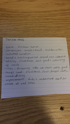
This group liked the contrapuntal sound track that we had written and recorded. They said it was effective and they also liked the fast-past flashback shots. However this group also noted that they didn't understand the need for smoke at the end titles. TDAC were quite surprised by this comment because the smoke at the end is one of our favourite parts; it also looks like it's the exhaust coming out of the car. We have decided to keep the smoke in this because otherwise the typography would be simple and slightly too 'flat' and still as nothing else is moving or happening.
This group made a very valid point of a mistake that we had made in the editing that no one else had picked up on. The '14 hours, 57 minutes, 32...33...34...etc minutes earlier' was actually counting up when it should have been counting down i.e. getting nearer to the castle scene, not further away. We were very grateful that they picked up on this mistake as we hadn't spotted it. It can be easily changed, we'll just need to count down instead.
This group liked the fake wounds and the severed ear, they also liked the smokey effect and the muffled earphone music.
This group liked the puddle shot that Tia took and they also liked the typography that Charley created with the two separate colours (white and red) on the word 'senseless'. They did seem to be unsure about the genre though but they put 'gore' down but also psychological so we will need to evaluate our opening to ensure that we include more conventions of a slasher genre.
This group also made an interesting point regarding the countdown. If it had been 14 hours earlier then it would have been dark so to correct this we changed it to 23 hours earlier so it was roughly the same time just in the space of two days instead. They also said that they didn't think the title was conventional, but again after discussing and with all the research we did, we decided to stick with it because it was a one word title like a lot of them are and it is also to do with having one less sense.
This group also made a comment that we agreed with; the panning shot is too fast and the reason why it's in there is to separate two shots of Tia so the continuity is smoother, however we can probably find another bit of footage to go in instead.
And finally again, this group made a valid point about the titles being 'better integrated with the background' and so we are going to try stabilising the shots so they are more still and then making the text fit better on the edge of the prop that we have chosen to put it on. They said they liked the smoke, the editing with names was amazing and they liked the headphone music as well.
All in all we are quite pleased with our feedback and we will be making adjustments accordingly. As mentioned there are a few changes that we will be needing to make such as the clock countdown but there are also some comments which we have taken into consideration but won't be acting upon, like the smoke at the end title.


No comments:
Post a Comment